T-Mobile: Design Across the Stack
Making dense network data, and the teams behind it, clear to the people making decisions.
- Problem
- Engineers, a new org and its products all had to be understood by people far from the work.
- My part
- Dashboard and icons, stakeholder research, IES and Veloce identity, naming, and product videos.
- Decision
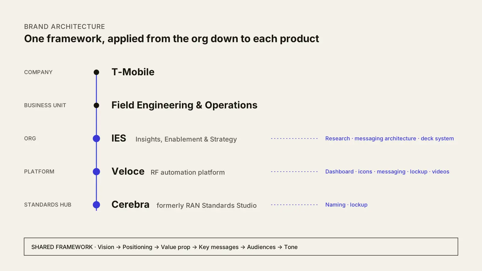
- Build one messaging framework and visual system, then apply it from the org down to each product.
- Outcome
- Veloce designs shipped to dev, Cerebra joined the 2026 roadmap, and the LESA reel reached the C-suite.
Overview
I joined a small team as a UX designer to build a planning platform for RF engineers under Veloce, T-Mobile's new automation initiative. The challenge was clear from the start: how do you present dense, technical information in a way that actually helps the people using it?
That question, how do we make the opaque transparent, followed us through every engagement after. Our work grew from product design into research, naming, brand identity and video. The audience kept changing, from engineers to a newly formed org to executives, but the job stayed the same: give each group a clear way into complex work.
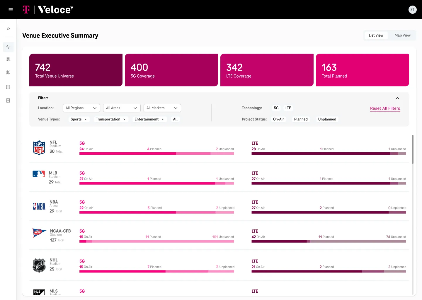
Product: Veloce
RF engineers work in some of the most information-dense environments in telecom. Before a deployment went to production, they had to weigh:
- Cost
- Coverage range
- Technology compatibility
- Geographic constraints
All of this lived in disconnected spreadsheets with no shared view. Our job was to bring it into one place without losing the precision engineers depended on.
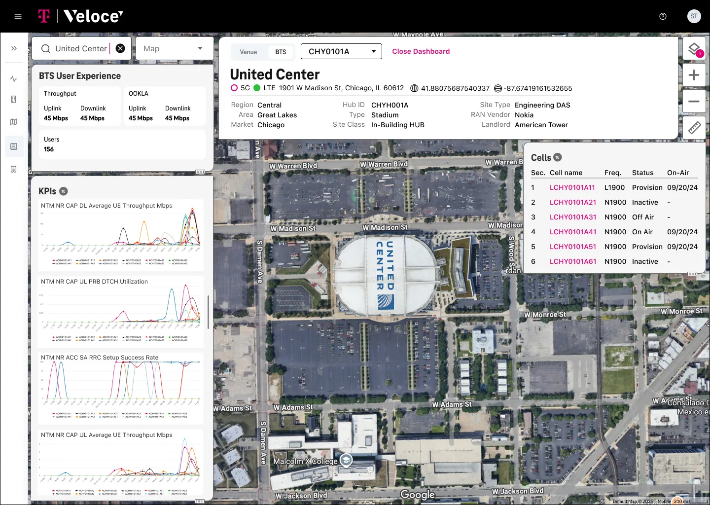
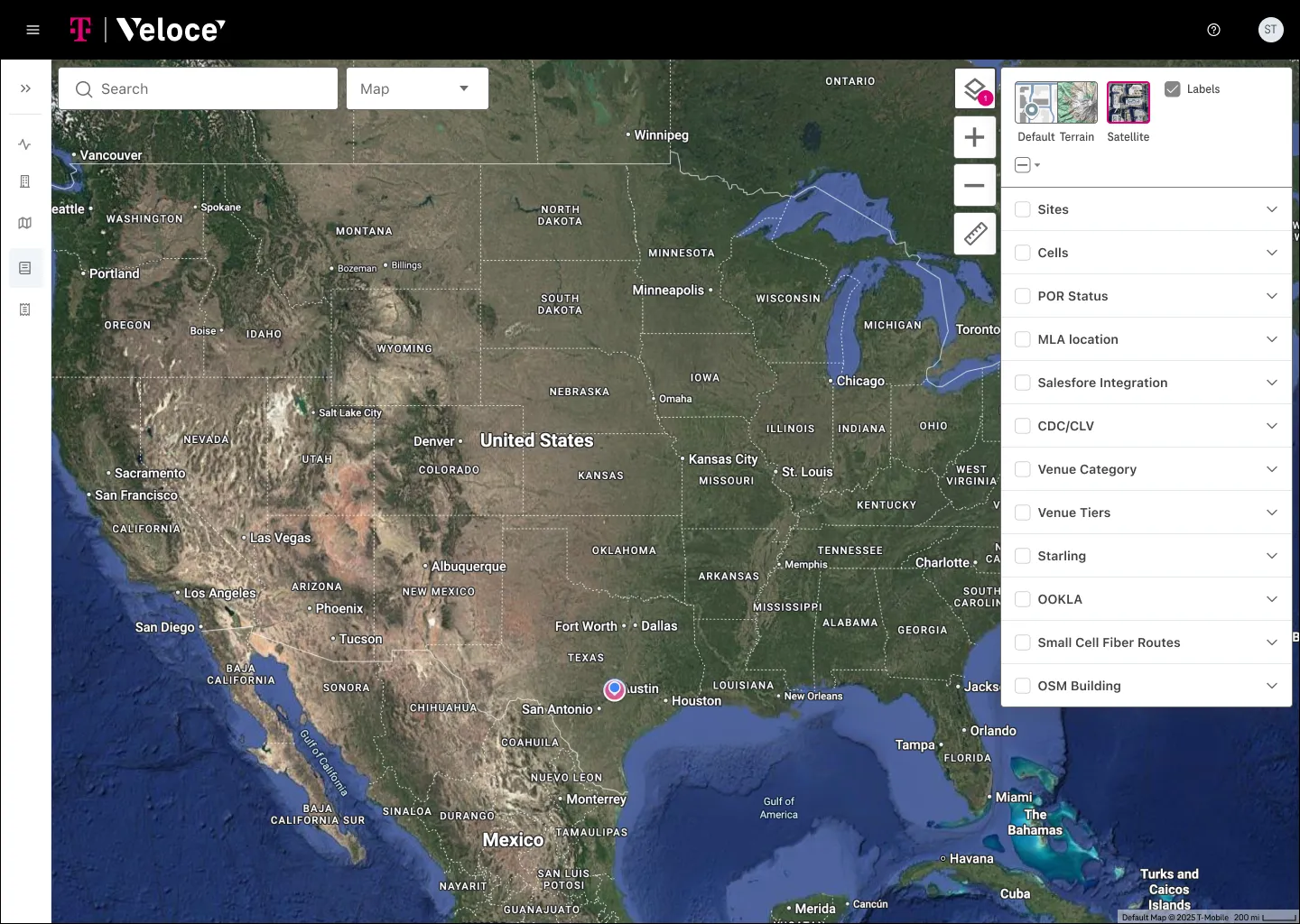
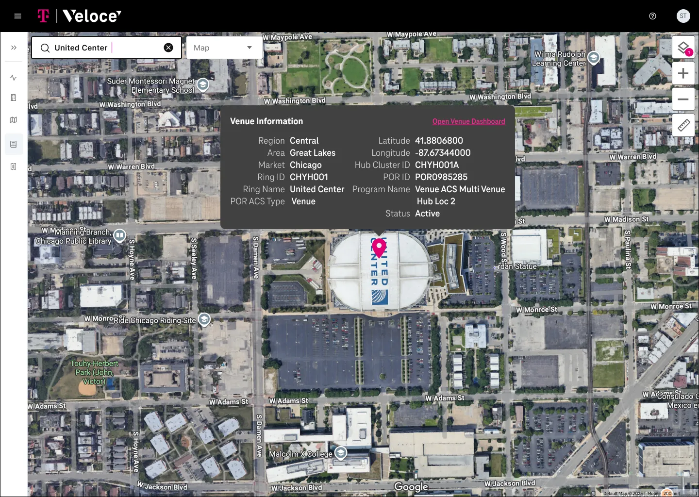
Starting from the map
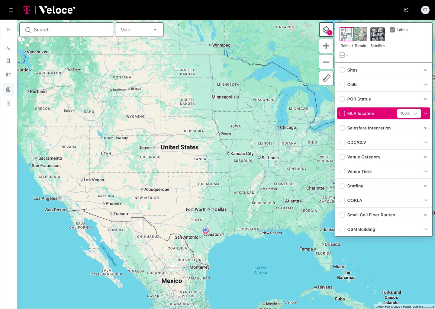
Working with our engineering lead as product owner, we anchored the product on a map. Location was the first thing engineers reached for, and everything else made more sense once it was grounded there. A layering system became the core interaction, letting engineers compare and filter deployments without losing the bigger picture.
Adapting to feedback
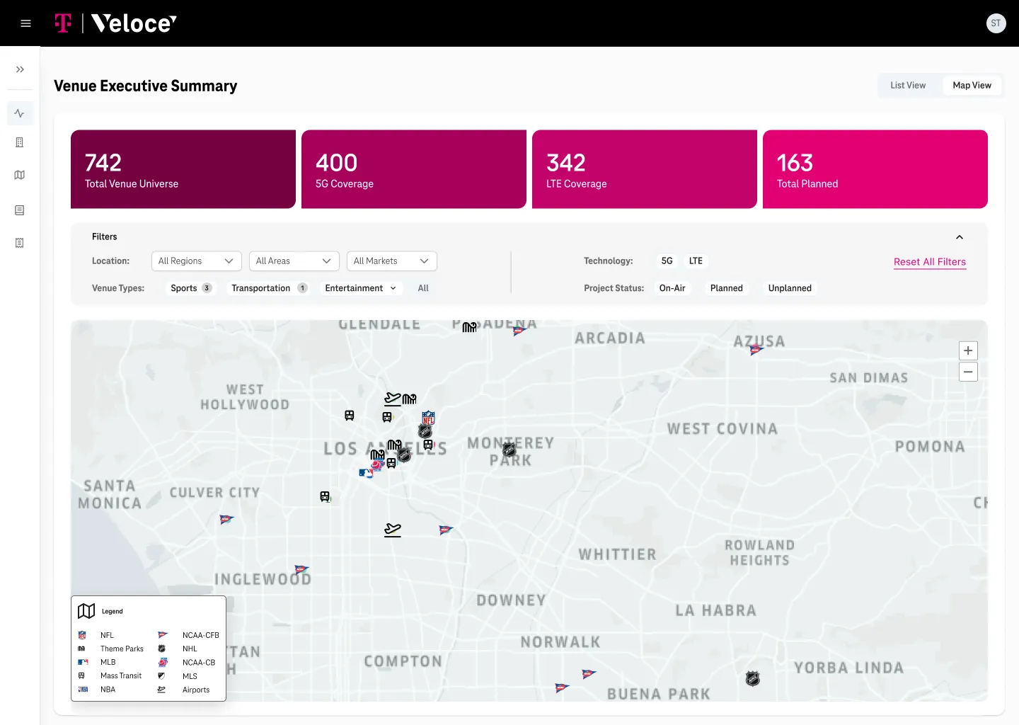
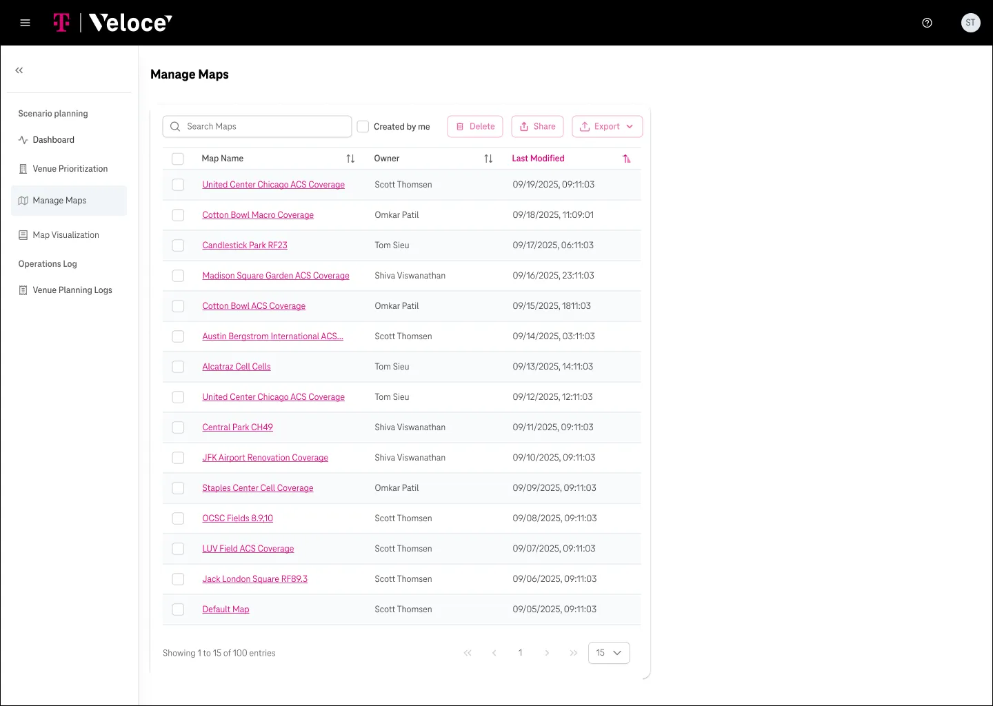
Engineer feedback surfaced gaps we hadn't scoped: more data types, new layer sets, and a way to manage saved maps. We added all three.
What I owned
Scott and I split the product. I owned the dashboard and the icon and logo sets, Scott owned the layer system inside the map. We reviewed each other's work throughout, and the designs were handed off to engineering for development.
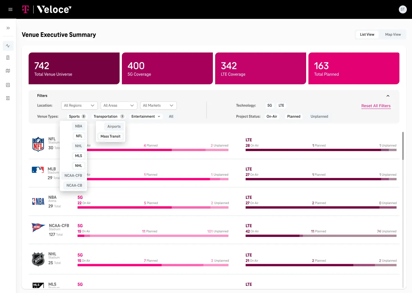
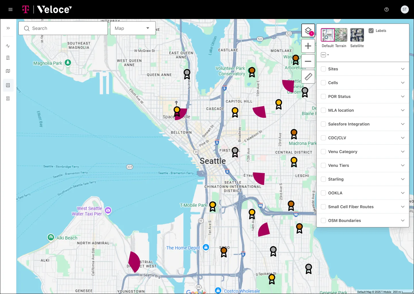
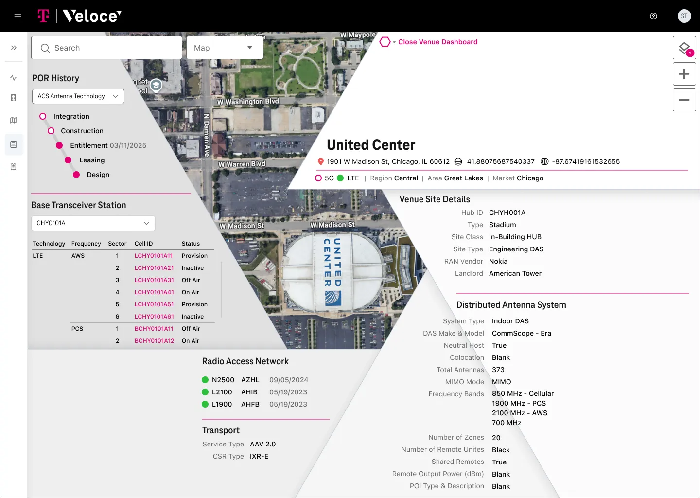
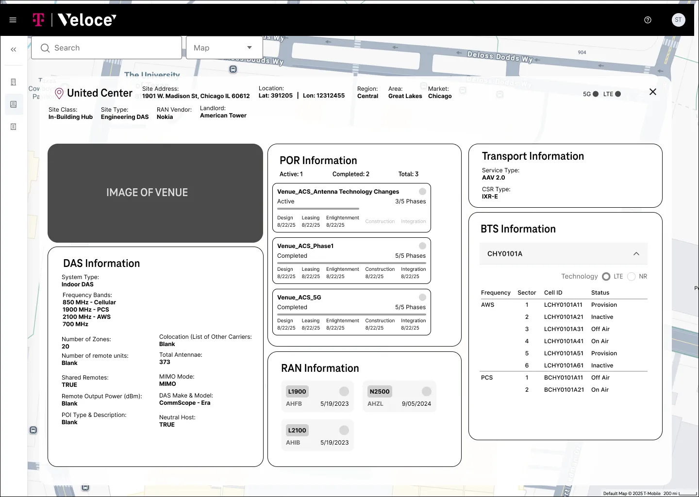
The result replaced raw data density with a visual language engineers could reason with. It didn't simplify the information, it gave it a form that made decisions faster and easier to defend. The wider Veloce platform went on to cut core RF tasks from hours to minutes.
Research: Listening to the engineering group
Next we interviewed six leads across a field engineering and operations group that had recently started working together. We wanted to understand each person's role, what they valued, where their work broke down, and where Veloce could fit into their day.
We talked to everyone one on one. In describing their own work, each person brought up their colleagues: how they collaborated, where handoffs failed, what they wished the other side understood. Pulling those threads together let us map relationships that a survey or group session would have missed.
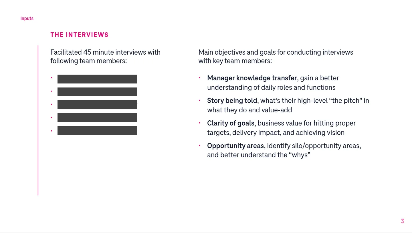
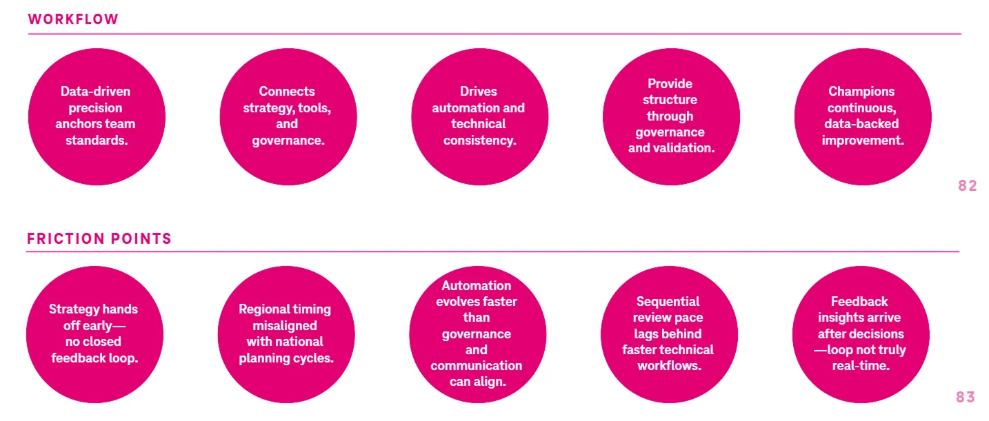
For each lead we wrote a story, a set of opportunities, and a short roadmap showing where Veloce could take manual work off their plate. Across all six, the need was the same: less manual work, clearer alignment, and one trusted system from planning to performance.
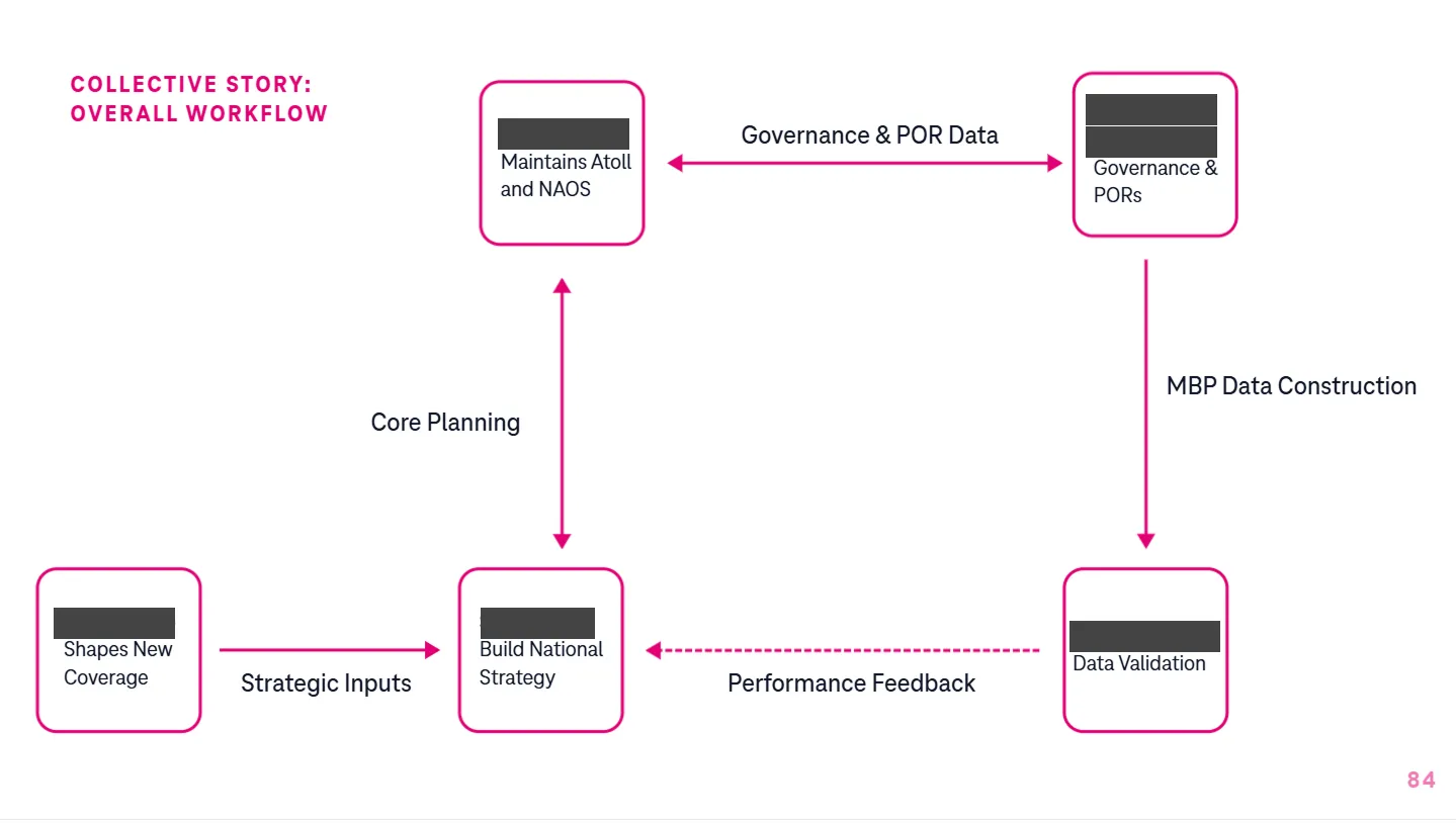
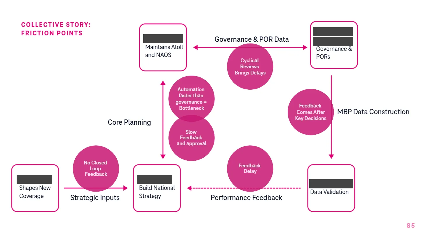
That shared need became the logic for everything after. Then the group was reorganized, and a new strategy org formed above it.
Strategy: Giving IES an identity
After the reorg, a new executive group called IES (Insights, Enablement and Strategy) was formed to drive data, insights and strategy across Field Engineering & Operations. It had a mandate but no shared story. We ran a four-week sprint to give it one.
We interviewed the five pillar leaders about their roles, what success would look like, the problem IES existed to solve, and the metaphor that best captured it.
Interview Goals
- Gain insights into your role, pillar?
- Better understanding (definition) of IES from you POV?
- What is the true realized value of IES?
Discussion to Cover
- Intent / Impact of pillars of IES?
- Why it matters for your end users, audiences?
- Connective tissue across IES pillars horizontally?
Interview Questions
Pillar-Specific
- Tell us about your role + responsibilities?
- What is your pillar's unique value proposition?
- What are the 2-3 KPIs that prove your pillar is succeeding?
Vision & Mission
- What key problem(s) are we solving for with the creation of IES?
- What does success (moonshot goal) look like for IES / for FE&O
- If moonshot goal is achieved, what becomes possible
Business & Customer Impact
- What customer experience improvements should/will IES enable?
- What business metrics should move because IES exists?
- What is the horizontal impact, connective tissue across IES
Identity & Storytelling
- What's the elevator pitch for IES?
- What analogy or metaphor best captures what IES does?
From those interviews we drafted six themes, then cut them to three: Strategic Focus, Horizontal Orchestration, and Scaling for Impact. Each theme became a full messaging stack: vision, positioning, value proposition, key messages by audience, and tone.
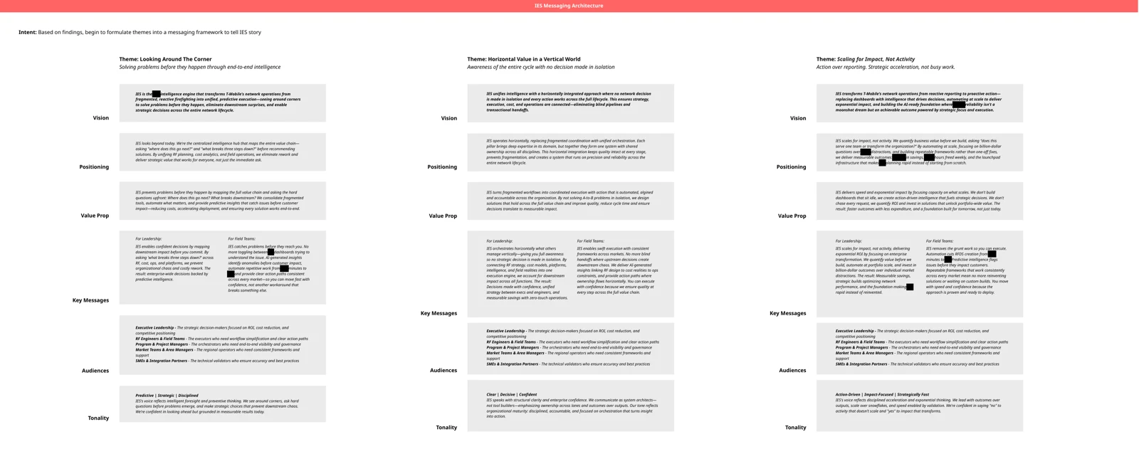
The final framework was a chain: data leads to governance, governance creates accountability, and accountability makes execution predictable. That became the IES vision, mission, operating principles and guardrails, delivered as a brand playbook and an executive deck.
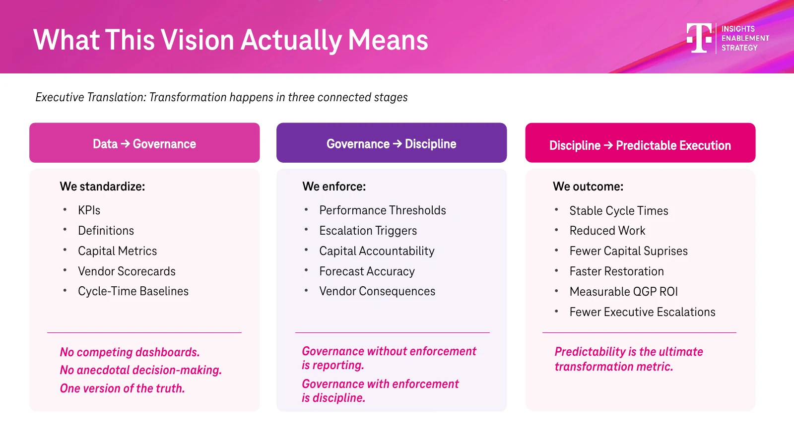
Identity: One system, many brands
IES needed to look like one org, and so did the products under it. We built a deck template and a set of lockups that IES and Veloce both used, so a leadership update and a platform review read as the same family.
We ran the same messaging framework on Veloce. Its voice was confident, pragmatic and forward thinking, grounded in measurable results rather than hype. The line we landed on was "Smarter Tools. Faster Teams. Better Network."
Naming: Cerebra
Inside Veloce, a hub called RAN Standards Studio governed the templates, business rules and reference data that automation depends on. The team wanted a name for what it would become next.
The brief set the boundaries. The name shouldn't be too literal or too abstract. It should feel forward looking, carry authority, and work as a north star: the place you go for the source of truth.
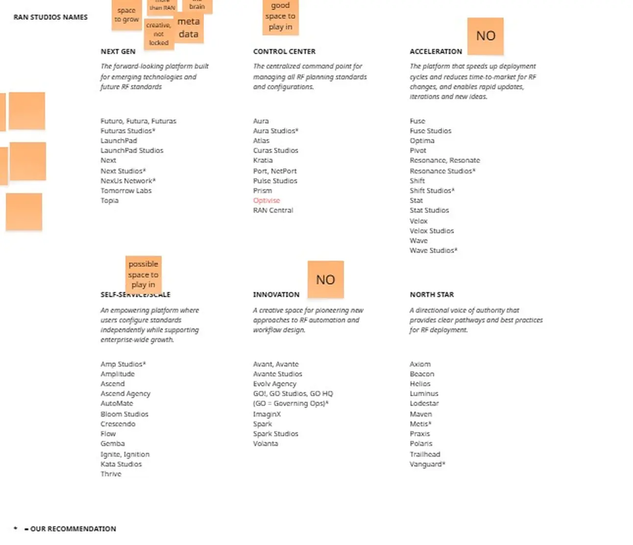
Round one explored six directions, including Next Gen, Control Center, Acceleration and North Star. Round two narrowed to three metaphors: a control center, a nervous system, and a self-service space. Cerebra came out of the nervous system direction, the brain and engine behind everything else.
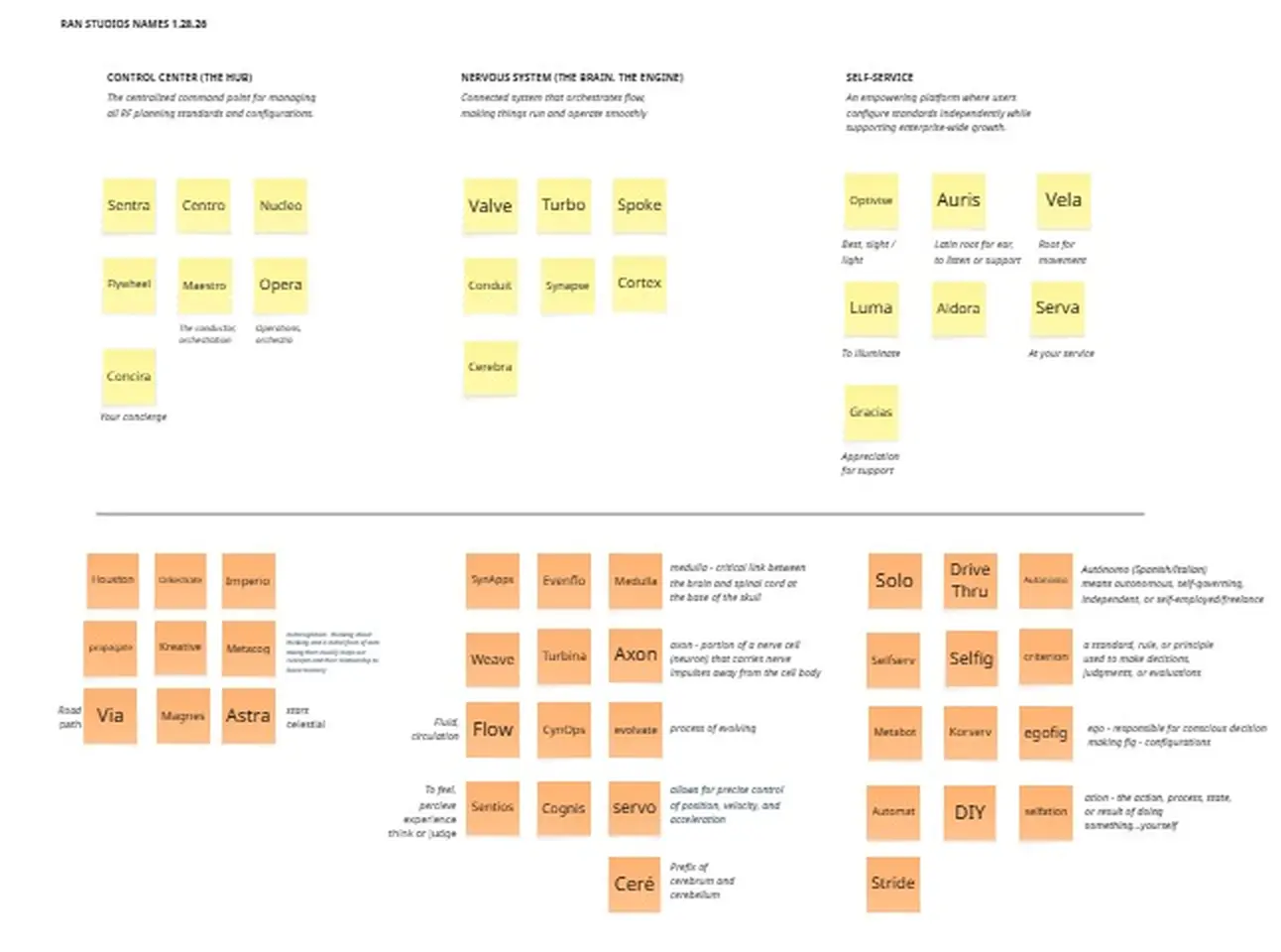
Cerebra was chosen as the final name. Tom designed the logo and we built the lockups. It now sits on Veloce's roadmap as the standards governance layer.
Storytelling: Product videos
The people building a product are always too close to it. They see the specific engineering problem. Executives see budget, scale and business impact. That gap is where most internal pitches fail, and our job was to reframe these products as business solutions, not engineering solutions.
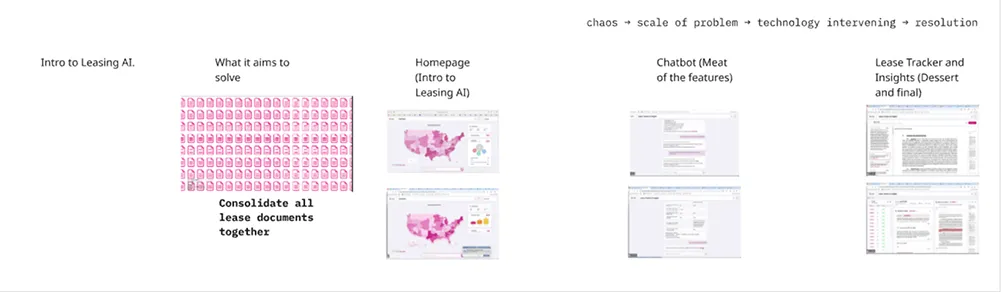
For each video we started with the product owners to understand what they wanted to highlight, then reframed it around the question an executive is actually asking: is this worth investing in? Problems were shown as business costs, not team frustrations.
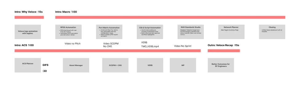
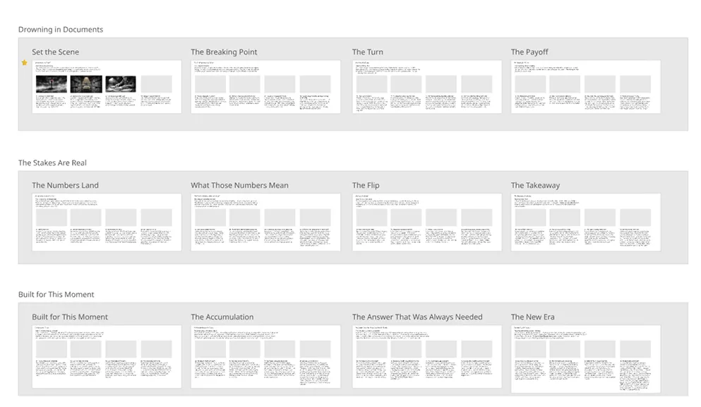
Every video followed the same structure: establish the problem, show the specific capabilities that solve it, then close by tying the outcome back to the opening. We made videos for ACS Hub, the Veloce automation suite, and individual products within them.

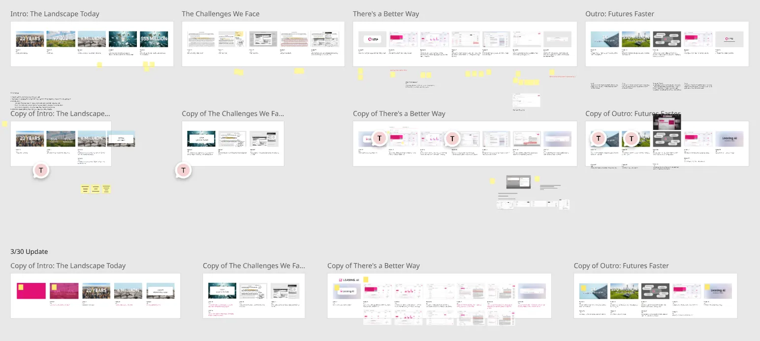
Product owners had strong opinions about length and feature coverage, which made sense given how much work sat behind each product. We used storyboards to negotiate, walking stakeholders through the flow and showing where their instincts would work against the audience before offering alternatives.
LESA: Branding a launch
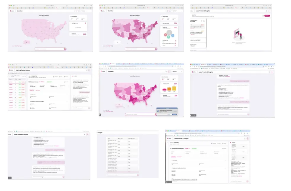
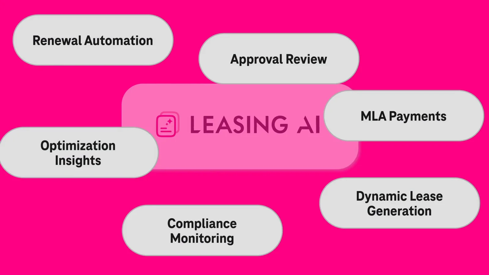
LESA, short for Leasing AI, reads and connects decades of cell site lease documents so teams can find answers in seconds instead of searching by hand. The product team built the platform and its UI. We built the narrative, the motion and the lockup for its launch video.
We wrote four treatments before landing on one. Each took a different way in: the scale of the problem, the numbers on their own, the history of how the archive built up, and a leasing expert's ordinary morning. All of them followed the same arc: chaos, the size of the problem, the technology stepping in, and the resolution.
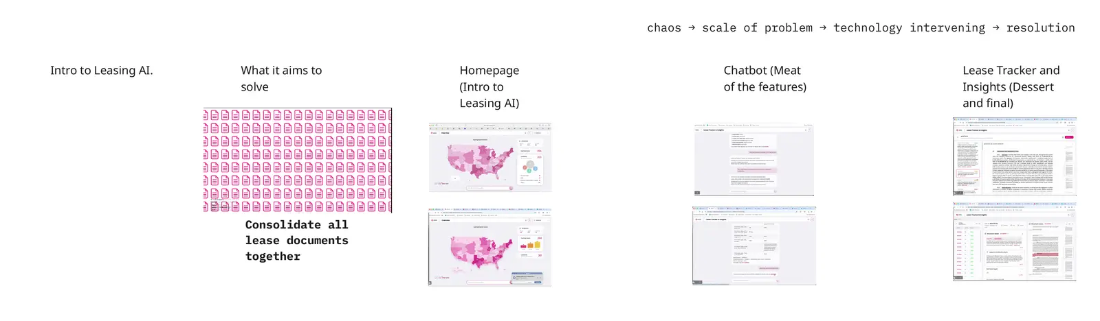
Stakeholder reviews changed the message. Early drafts leaned on document scanning, but the real value was the knowledge graph that connects every lease and amendment, and the fact that experts validate what the AI extracts. We rebuilt the middle of the video around both.
Visually, a magenta treatment ties the intro and outro together. Headlines are set large in a heavy display weight with a drop shadow so they hold up over busy footage. The lockup builds on the product's existing mark.
Outcomes
- Veloce dashboard and icon system handed off to engineering for development
- Research mapped where Veloce fit into six leads' workflows
- IES launched with a brand playbook, messaging architecture and executive deck
- Cerebra named, locked up and placed on the Veloce roadmap
- Video scope grew from one overview to five product videos and an executive hero reel
- The LESA hero reel was presented to C-suite leadership, including CTOs and SVPs
Continued scope expansion was the clearest signal the work was landing.
Capping off
The audience kept changing, from RF engineers reading deployment data to a new org figuring out who it was to executives deciding what to fund. The problem didn't. Each time, the work was about removing what stood between people and the information they needed.
That's why this work spans product design, research, naming, identity and video. Each audience needed a different way into the same complex work. The map helped engineers read data in context. Interviews made team friction visible. A shared framework gave a new org and its products one voice. Storyboards helped product owners explain their tools to the people funding them.